Introducing the UX Component
Description
The UX Component is one of the basic building blocks for Alpha Anywhere applications. It is generally the main component for creating mobile apps.
Finding the UX Builder
There are a couple ways to locate the UX Component Builder in Alpha Anywhere
Finding the UX Builder using the "Create" menu
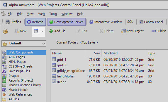
If you have set up Web Security already, Go to the Web Projects Control Panel and click in the Create dropdown list.
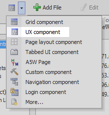
 The Create dropdown
From the list choose the UX Component option. The Select UX Component Dialog will then open..
 Component options
Finding the UX Builder through the "New" menu
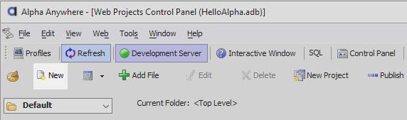
Alternatively, click New on the Web Projects Control Panel toolbar.
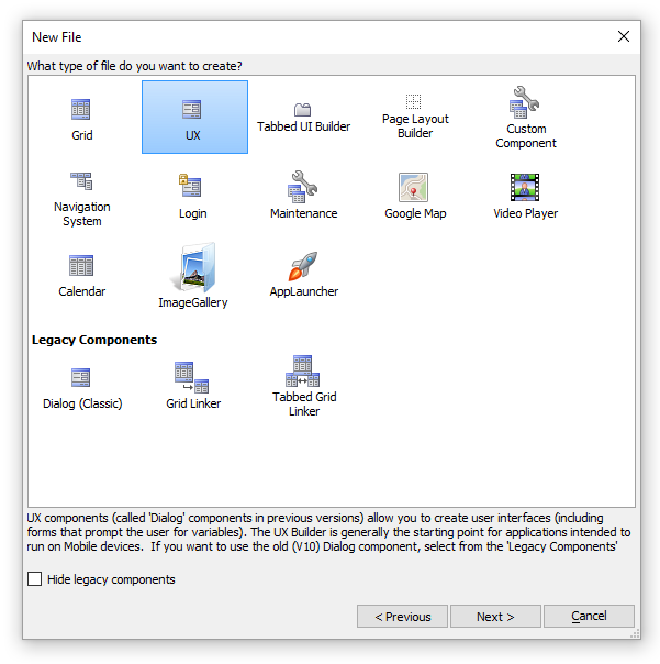
In the New File Dialog select Web Component and click Next > .
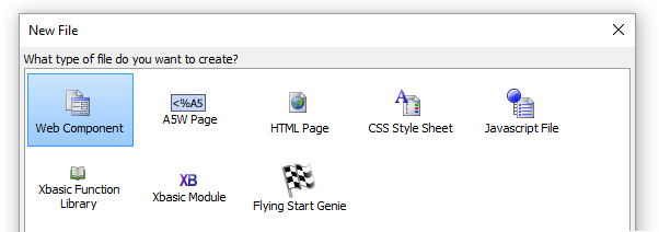
When prompted for what type file you want to create, click UX and Next > .
The Select UX Component Dialog will load. Choose whether you want to work from a template or start with blank Grid Component and click OK. The UX Builder will then appear. The available template options are described in the following section.
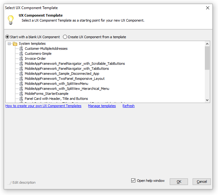 The Select UX Component Dialog
UX Templates
When you create a new UX component you have the option of either creating a completely new blank component or using a pre-existing template. This provides a structure to which additional controls additional controls can be added and existing ones can be customized to your liking. A complete list of template pages is provided in the following link:
- UX Templates
UX Templates can be used as a starting point for creating new applications, adding login and security management interfaces, and more.
Toolbar Functions

The UX Builder contains the following tools on it's toolbar.

Save. Saves the currently open grid.

Save As. Saves the currently open grid after asking for the path and filename.

Save Page. Creates a temporary file that contains the grid, optionally opening the page in the HTML Editor.

Open. Allows you to select and open an existing grid from any of your projects.

New. Allows you to create a new grid.

Browser. Displays the grid component in a temporary page in your browser of choice.

Remote Test. Test on a remote device (such as a phone or tablet)

Publish. Publishes the grid to the destination associated with the selected profile.

Web Projects. Displays the Web Projects Control Panel.

SQL. Loads the SQL Tools menu.

Web Style Builder. Opens the Web Style Builder

Server. Turn the server on and off, when on the server icon appears green.

Close. Closes the Grid Builder.
Page Menu
The page menu lets you select the different UX builder pages that allow you to construct a UX component.
Page options are listed below. When you first open the UX Builder the page menu will appear like this:
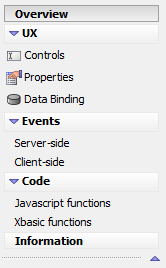
Pages
- Overview
A basic intro page that describes the UX Component and how to get started.
- UX > Controls
Specifies the controls and control properties that will appear in the UX.
- UX > Properties
Specifies properties for the UX component.
- UX > Data Binding
Bind UX controls with new or existing tables.
- Events > Server-side
Allows you to set server-side events
- Events > Client-side
Allows you to set Client-side events
- Code > Javascript functions
Allows you to add javascript to a UX, edit javascript functions, and add javascript actions.
- Code > Xbasic functions
Allows you to add and manipulate Xbasic function
- Information
Allows you to record information about the UX.